Multiple Methods: A Print Exhibition
My process can vary depending on the project. If I am doing work for a client or on a specific subject matter I write down everything I can think of related to the subject. I look for how those things might relate to each other visually (by form, purpose, etc.). Then I do a lot of research—both visual and background on the subject—so that I can create an image that will have impact and communicate what I am trying to say effectively.
This project was a little different because I was the client and the subject matter was myself. This poster was done as part of a series on the idea of “asylum” for an exhibition of my work in a gallery.
Years ago, I was a recent grad looking for a name for my freelance design business. The nom de guerre that I decided upon was “Asylum.” It appealed to me for many reasons but primarily because it is a word that can mean two seemingly opposite things. For some people the word conveys a sense of security—a safe haven worth seeking. For others it might mean a place of lunacy—a world just a bit off kilter.
Coincidentally, another reason for the name “Asylum” is that the hospital where I was born also served as a sanitarium—it says Porter Sanitarium and Hospital right there on my birth certificate ;-).
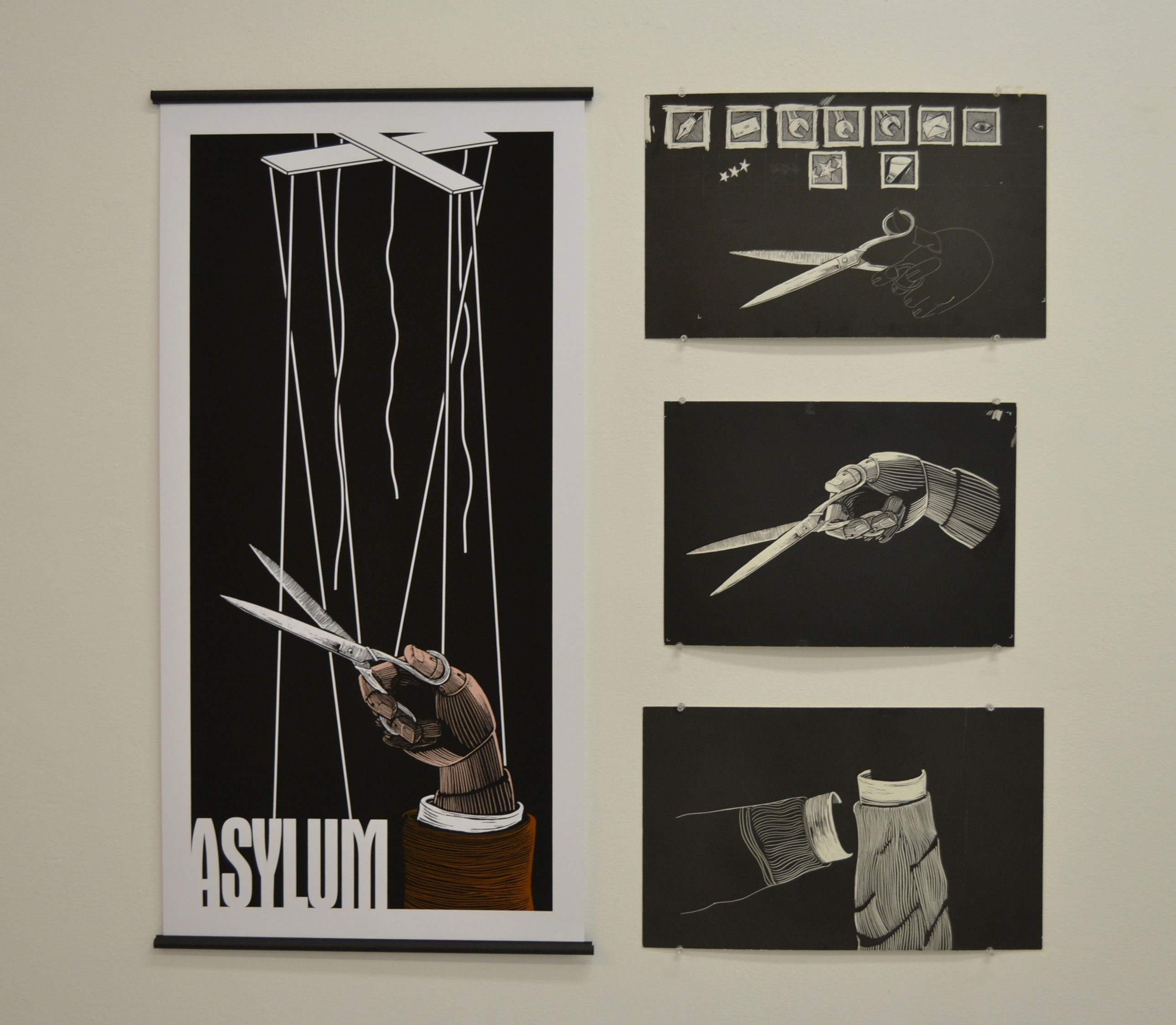
For this poster I was inspired by a theater poster I had designed when I was an undergraduate. I don’t recall the name of the play but it had to do with death. For the poster I created an image of several human figures controlled by marionette strings. One of the figures was the skeletal remnant of a person who had used scissors to cut all the tethers.
I decided to re-visit this idea for my Asylum series because the marionette has a choice between being someone else’s puppet or the loss that would come with cutting himself free. Is remaining a puppet the safe choice or is it the path to madness?
The original poster was all hand drawn and done with transparent overlays of images shot with a stat camera (we did not have computers or Photoshop back then). In the updated version I eliminated the other figures and focused the image on the point of contact—where the hand with the scissors is cutting the strings. Since in the updated version the hand had not yet cut all of the strings I replaced the skeletal hand with one that looked like it belongs to a puppet. To create the updated image I first shot photographs of my own hand holding scissors then, using those photos as resource, drew the image. Using tracing paper, I transferred the drawing onto black scratchboard and working reductively scratched out the image using an x-acto knife and a printmaker’s etching needle. It took several drawings to get the image the way I wanted it. In some cases I drew parts of the image separately. I would then scan them into the computer and combine and refine them in Photoshop. The image was then brought into Adobe Illustrator (vector software) where the marionette control bars and strings were created and the Asylum type added. The poster is printed using an Epson Stylus Pro 9900 on archival matte paper with UltraChrome HDR ink.
